Services
- Disruptive Brand Identity
- Premium CPG Packaging Design
- Custom E-commerce Design & UX
- 3D Product Visualization
- Retail and Tradeshow Collateral
- Mixologist Outreach Strategy
- Performance Digital Campaigns
Filthy Food
Overview
Filthy isn’t your average garnish, and they didn’t want an average brand. This premium line of cocktail garnishes needed an identity as bold as its flavor. James Ross built a disruptive CPG brand from the ground up—packaging, e-commerce, and go-to-market strategy—all to make Filthy the garnish of choice in top bars and homes nationwide.
The Challenge
Filthy Food had a killer product and a cheeky name, but without a consistent visual identity or launch plan, the brand needed to stand out on crowded shelves, earn credibility with mixologists, and engage modern consumers through a best-in-class digital experience.
The Solution
The solution was a full-spectrum brand and market launch that transformed Filthy into a disruptive CPG leader. We combined strategic rigor and bold creative attitude to deliver everything needed, from packaging and e-commerce to targeted mixologist outreach.
Brand Identity and Packaging
- Crafted an irreverent logo and visual system that matched the brand’s personality
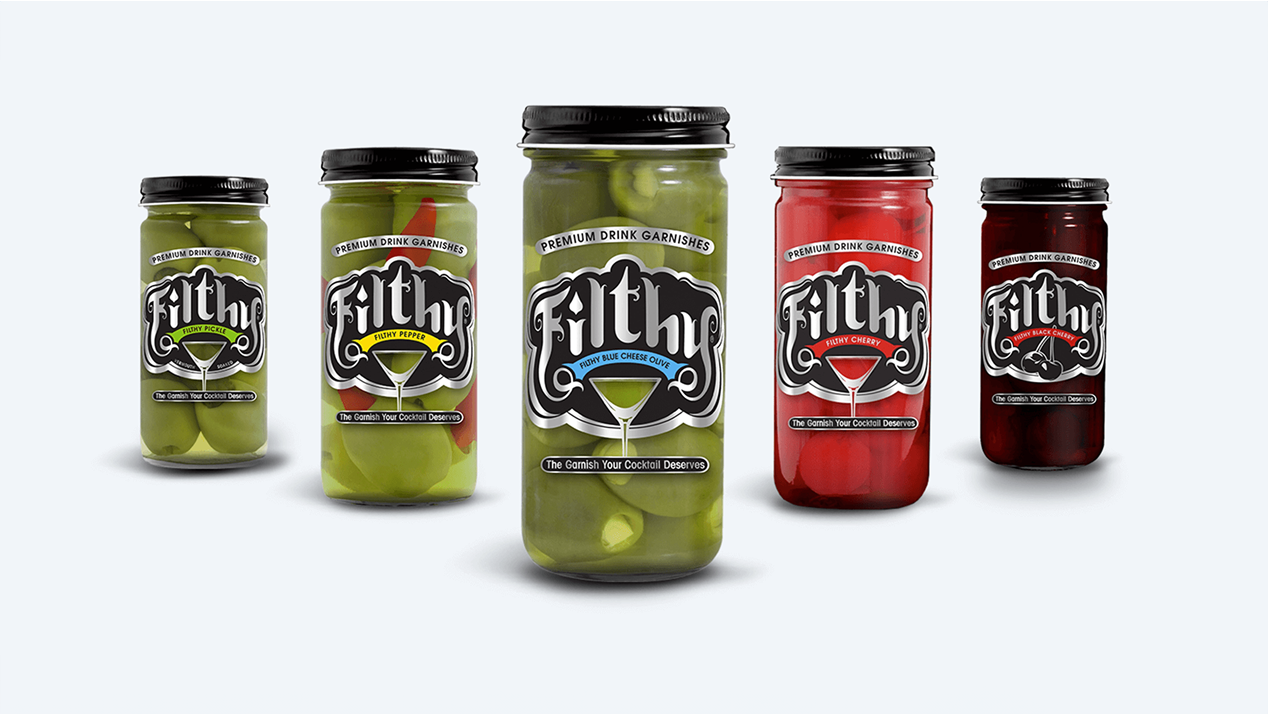
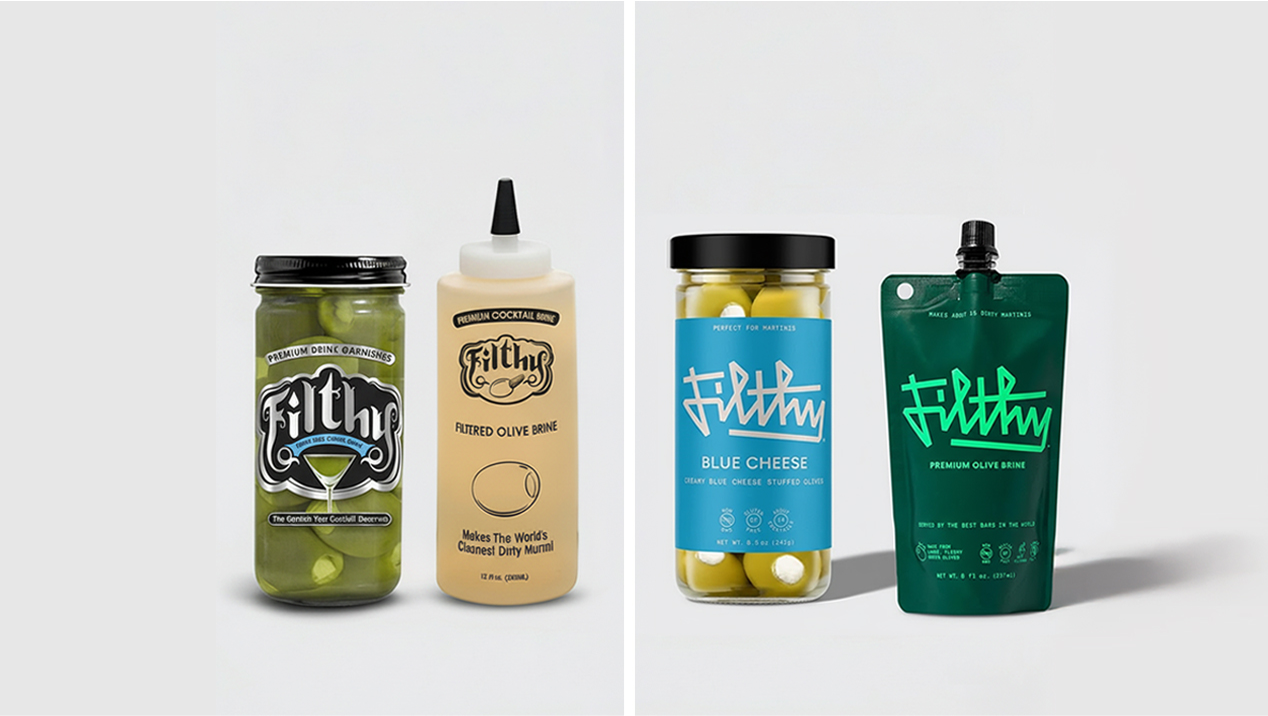
- Designed sleek black-and-silver packaging with a wink-and-nod aesthetic
- Produced shelf-talkers, neck tags, and in-store brochures to amplify retail impact
Website and E-commerce
- Developed a fully responsive, shoppable site that highlights premium positioning
- Built 3D product models and custom imagery for every SKU
- Optimized UX for seamless browsing and checkout
Go-to-Market Strategy
- Launched targeted outreach to mixologists in key U.S. cities
- Created tradeshow displays and event collateral to fuel bar partnerships
- Delivered retail display concepts for major chains like Total Wine
Digital and Social Campaigns
- Deployed and tested PPC and retargeting ads to drive direct sales
- Refined messaging for top-performing social and search content
The Results
Standout shelf presence and an identity that commands attention
Widespread adoption by bartenders and cocktail enthusiasts in major markets
A seamless e-commerce experience that converts and scales with demand
A bold brand personality that matches Filthy’s flavor and attitude
Featured Work
Let’s Make Your Brand the One Everyone Talks About
Whether you’re launching something daring or elevating a great product, James Ross is ready to build a brand that sticks.
